ART CLASS DAY 14: HUMANIST CALLIGRAPHY
There is a magical store in Berkeley, California called Castle in the Air. If you sneak past the beautiful imported paper, fancy fountain pens, quirky stampers and piles of journals and shimmy up the stairs, taking care not to knock into any of the Black Forest cuckoo clocks lining the stairway, you’ll come to a little classroom at the top of the stairs.
Years ago, I took a crepe paper flower making course at Castle in the Air, with the misguided intention of making a crepe paper flower crown to wear on my wedding day. It turned out that I was lousy at making crepe paper flowers, don’t worry the wedding was still kick-ass and crafty.
 Fast-forward to now. I knew I wanted to take a workshop there again as part of my 30 days of art class project. Hand lettering is something I really wanted to get better at during this project.
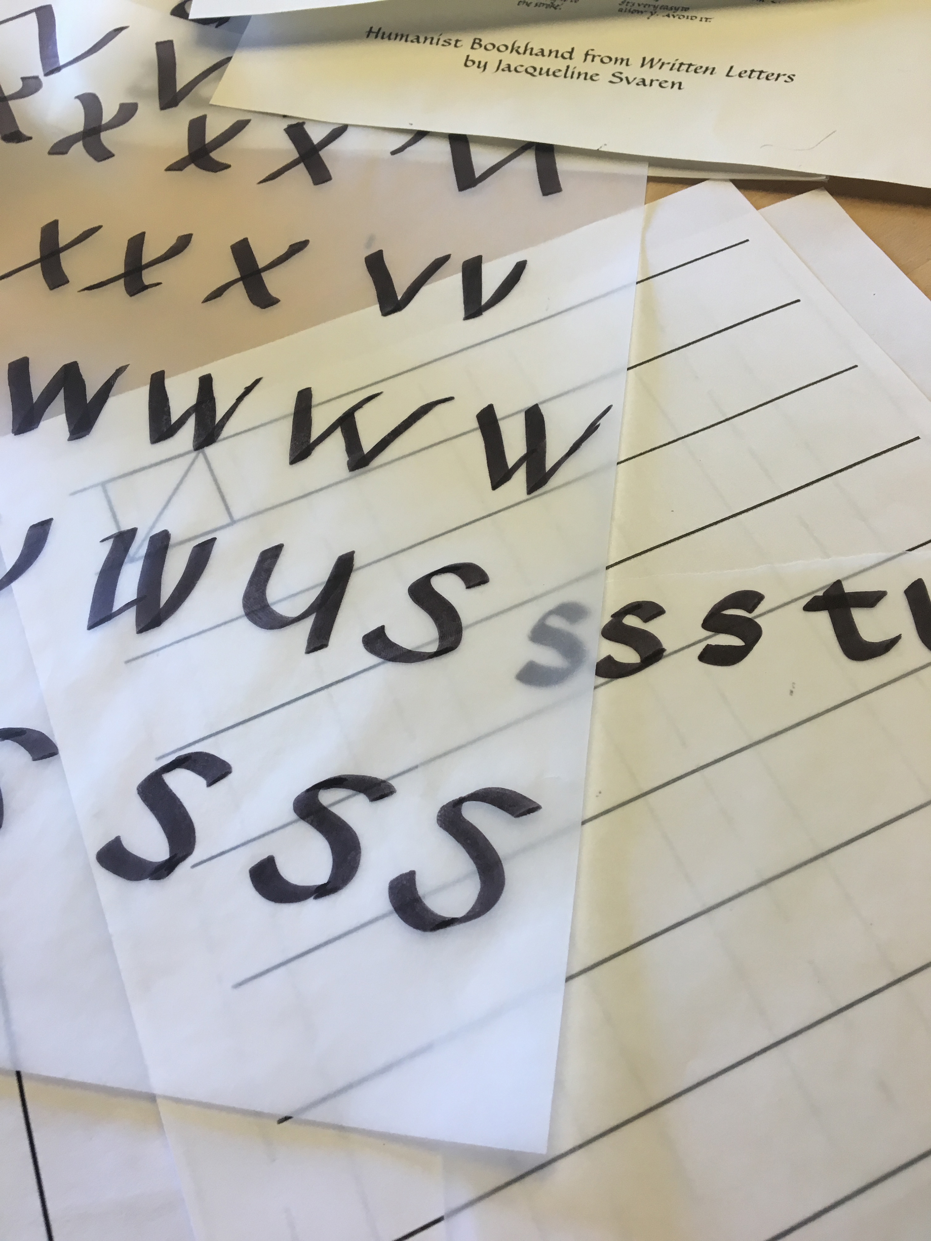
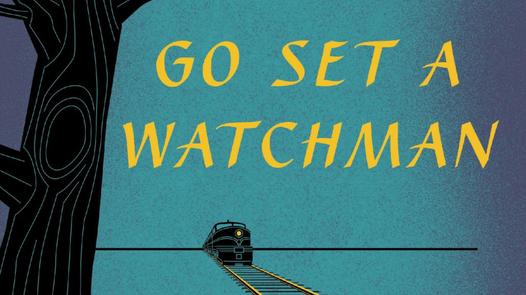
So, I signed up for “Humanist Calligraphy”, instructed by the very talented Paul Veres. Paul is a well-known Bay Area calligrapher who most recently discovered that Caterina, a font he based on his handwriting and released in the 90s was used for the title page of Harper Lee’s new novel “Go Set a Watchman.”
ABOUT THE CLASS
The class wasn’t very big (about ten students) but the small room was crowded with people ready to letter! Like many of the art and craft classes I attend, all of the students were female. It also became quickly apparent that everyone else in class was far better at calligraphy than I was. I’ve never really tried calligraphy before, this was my first ever calligraphy class, and my amateurish letters were not nearly as good as my fellow students. Although, after a full day of practice, they started looking a little bit better. I don’t think I’ll be lettering any signs anytime soon, but with more practice…. maybe I could address a few envelopes?